The visual question.
The restaurant and recognisable branding establish the subject, while the descending red line introduces business tension.
 DESIGN
FEATURED DESIGN / Business
A familiar brand. A visible downturn.
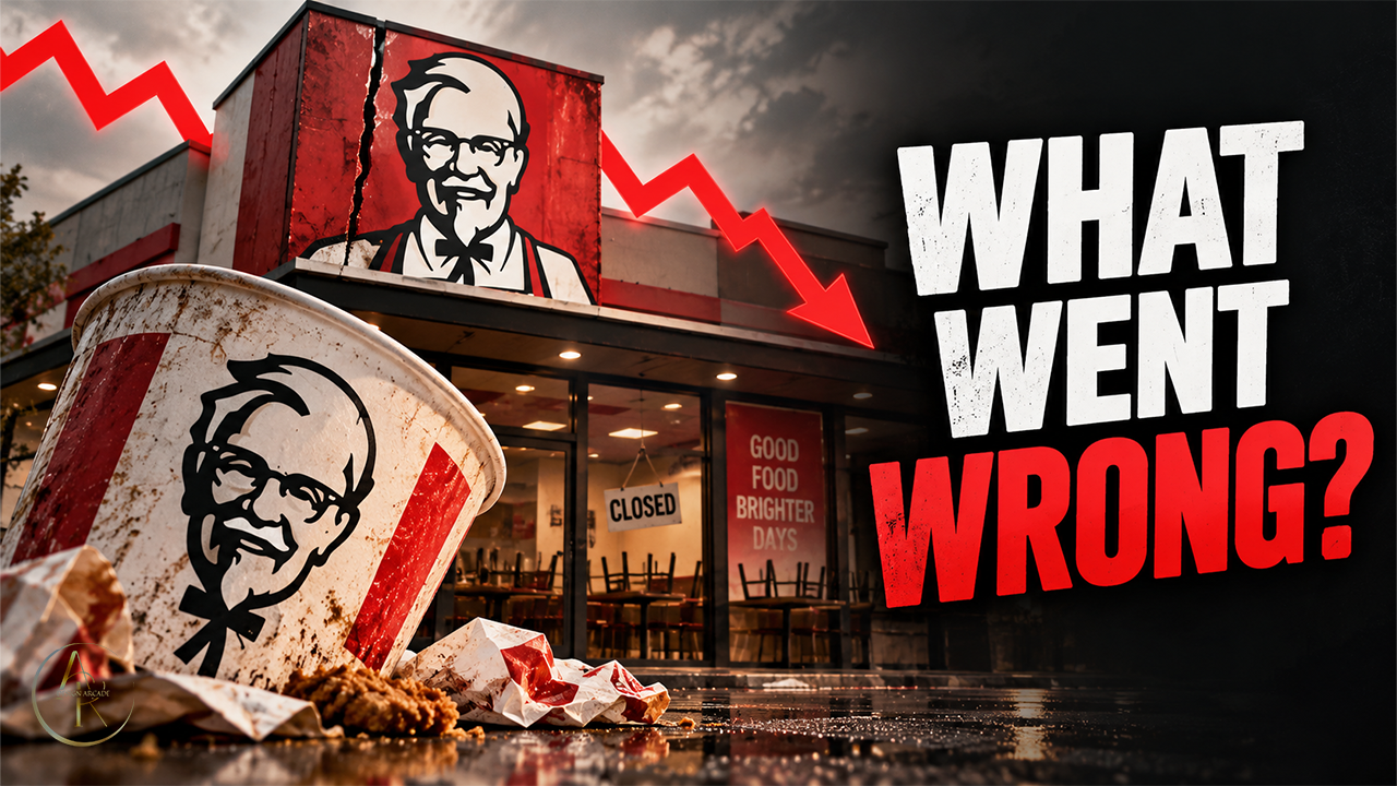
The restaurant and recognisable branding establish the subject, while the descending red line introduces business tension.
The restaurant occupies one side and the large question occupies the other. The falling line connects the two.
WHAT WENT WRONG? invites an explanation. The question and red direction cue make the premise readable before the smaller details.
The same artwork shown at 120 pixels wide. Compare the main subject and headline with the full-size image above.
Original artwork · scaled display onlyThis is a visual analysis of portfolio artwork. It does not claim a client commission, endorsement, published CTR or measured performance result.
One thumbnail or an ongoing creative partnership.